Choose one clean sans-serif font, use it at two weights, then pick a primary color that already signals trust in your industry. That combination handles 80% of the decision. The rest of this guide covers why those choices matter, how to make them confidently, and how to keep them consistent once you have them.
Font and color are trust signals. A visitor who lands on your website forms an opinion about your business in under two seconds, before they read your service list or your prices. If the typography looks cluttered or the colors clash, that opinion is negative, and recovering it with good copy is an uphill battle. This is not about aesthetics for aesthetics' sake. It is about removing friction from the moment a potential customer decides whether to stay or leave.
This post is part of our website foundation guide for service businesses, which covers everything from page structure to hosting. Fonts and colors are one piece of that foundation, and they connect directly to your brand kit, which is where your choices get locked in for the long term.
Why do fonts and colors affect whether someone calls or books?
Typography and color are credibility signals, and credibility is a prerequisite for action. Before a visitor fills out a form, calls a number, or books an appointment, they make a judgment about whether your business is real, professional, and worth their time. Your font and color choices are part of that judgment, whether you intended them to be or not.
Consider two plumbers in the same market. One picked a bold italic red font for his logo because it looked strong, and carried that energy onto his website with a dark background, heavy text, and animated accent colors. His quote form quietly underperforms: visitors reach it, hesitate, and leave without finishing. A competing plumber in the same area runs a clean navy-and-white site with a single readable font, and his quote form completes at a noticeably higher rate. Same service, same geography, same form fields. The gap is almost entirely visual credibility.
The visitor is not consciously thinking "I distrust that font." They are thinking "this site looks sketchy" or "this looks like the real deal," and they cannot always explain why. Font and color are doing that work silently in the background.
What is the best font for a service business website?
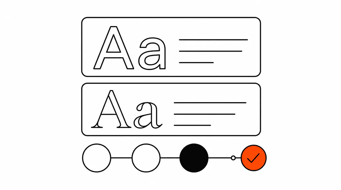
A clean sans-serif at two weights is the safest and most effective choice for almost every service business. Inter, Geist, and DM Sans are all free via Google Fonts, widely supported, and readable on every screen size. Pick one, set it at a regular weight for body text and semibold or bold for headings, and stop there.
The single most consistent pattern we see across the client sites we build and audit: businesses using one font at two weights get far fewer "make it feel more professional" revision requests than businesses who started with three different typefaces. Simplicity reads as premium to service business visitors. They are not there to admire type choices. They are there to confirm you can solve their problem. A clean, readable font gets out of the way and lets your content do the convincing.
Here is a short decision tree to narrow things down:
- If you want something safe and highly readable: Inter or DM Sans. Both are neutral, professional, and familiar without being generic.
- If you want a bit more personality with the same readability: Outfit or Plus Jakarta Sans. Both have slightly more character than Inter while staying very clean.
- If your logo already uses a specific sans-serif: match the website body font to it, or pair it with one of the neutral options above so there is no conflict.
- If you are tempted by a serif: serifs can work well for law firms, financial advisors, and some medical practices where formality matters. For HVAC, roofing, plumbing, or salons, a sans-serif is nearly always the better call.
One weight rule worth committing to: your body text should never go below 16px on desktop and 15px on mobile. Anything smaller and you start losing older visitors and anyone reading in average daylight conditions. Readability is a conversion factor, not just a comfort preference.
What font mistakes make a service business site look unprofessional?
Three font choices reliably damage credibility more than any others.
Too many typefaces. Using three or more fonts on a website is one of the clearest signals of an amateur build, and visitors read that signal before they read your copy. Every font you add creates a decision the eye has to make about which one is carrying the hierarchy. One font family removes that friction entirely.
Decorative fonts in body text. Script fonts, display fonts, and anything with heavy stylization are built for large headlines and short bursts of text. Applied to paragraphs or service descriptions, they slow reading speed noticeably and suggest the site was built without thinking about the person trying to use it.
Inconsistency across pages. Using one font on the homepage and a different one on the contact page is more common than you would expect, particularly on sites assembled from templates over time. It signals that no one is in charge of the site, which makes visitors wonder who is in charge of the business.
What colors make a service business look trustworthy?
Navy blue, charcoal, and dark forest green all carry strong trust associations for service businesses. Each of those pairs well with white or near-white backgrounds and gives you natural contrast for text and layout. Pick one as your primary, add white or light gray as your background, and choose one accent color for buttons, links, and key highlights.
The accent color is where most people make the biggest mistake. An accent is supposed to draw attention to the one thing you most want a visitor to click or read. If you use three different accent colors across a page, none of them draws attention. They compete with each other and the visitor's eye does not know where to land.
Color associations by industry context:
- Plumbing, HVAC, electrical: Navy, dark blue, or charcoal all work. These industries are already associated with competence and precision, and those color families reinforce that.
- Roofing, landscaping, construction: Deep green or charcoal. Forest green in particular carries connotations of durability and the outdoors without being too casual.
- Salons, medspas, wellness: Soft neutrals, warm whites, and dusty mauves or sage greens. Bright primaries feel clinical or commercial in this context and tend to push visitors away.
- Law firms, financial services: Navy or charcoal with gold or burgundy accents. These are conventional for a reason. Visitors in these categories have strong expectations and meeting them builds trust faster than subverting them.
- Cleaning services, pest control, home services in general: Clean white backgrounds with a bold single accent (cobalt blue, deep green) reads as organized and reliable.
The minimum contrast ratio required by WCAG 2.1 AA for normal body text. Many service business sites fail this on their primary call-to-action buttons.
Contrast matters practically as well as technically. A dark button on a white page is easy to read. A medium-gray button on a light-gray background is not, and a visitor who cannot easily read your call-to-action will not click it. If you are unsure whether your chosen color combination meets basic contrast standards, our website accessibility guide walks through how to check it with free tools in under five minutes.
How many colors should a service business website use?
Three is the practical upper limit, and many well-built service business sites run on two. A background, a primary text color, and one accent will handle every layout situation cleanly. The moment you add a fourth color, you start creating decisions about when to use which one, and those decisions compound across every page you build.
A simple system that works consistently: pick a dark primary (navy, charcoal, or deep green), a neutral background (white or a very light gray), and one accent in a contrasting hue for buttons and links only. Every element on the page then fits naturally into that system without requiring a new decision each time.
The temptation to add more colors usually comes from trying to differentiate sections or add visual interest to a flat layout. That is a structure problem, not a color problem. Adding a fourth color to compensate for a weak layout gives you a busier layout, not a better one. Section separation is better handled through spacing, dividers, and background shade variation within your existing palette.
Should my logo font match the font on my website?
They need to feel compatible, but they do not need to match exactly. Logo fonts are often chosen for visual impact at large sizes, which means they can be heavier, more stylized, or more distinctive than what you would want to read at 16px in a paragraph.
If your logo uses a serif or display typeface, pairing the website body with a clean neutral sans-serif creates good contrast without conflict. If your logo uses a basic sans-serif, matching or closely pairing the website body font is usually the right call. What to avoid: using the logo font for all body copy and headings on the site. It tends to feel heavy and can be hard to read at smaller sizes, especially if the logo typeface was designed for display use.
The same principle applies to color. Your logo's primary color should appear on your website, but it does not have to be the dominant color everywhere. If your logo is bold orange, that can be your accent color for buttons and key highlights without being the background of every section. The logo needs to feel at home on the site, not take it over.
How do I keep fonts and colors consistent across my whole website?
Lock your choices into a brand kit before you build anything, then enforce that kit technically wherever possible. A brand kit for a service business does not need to be elaborate: your primary font and weights, your hex codes for each color, your logo in its approved formats, and a one-sentence note on where each color gets used. That document, even if it is a single page, prevents the slow drift that happens when multiple people or templates touch a site over time.
On the technical side: if your site has a stylesheet, define your colors as CSS custom properties at the very top of that file. Something like --color-primary: #1a3a5c; means every element that references that variable updates instantly when you make a change. You never have to hunt through 30 pages to find where a hex code was hardcoded.
If you use a website builder, set your global styles once in the theme or brand settings, and treat any page-level style override as a flag that something went wrong. Page-by-page color overrides are how sites accumulate visual inconsistency over 18 months of updates.
The deeper issue is ownership. Most brand drift on service business sites happens because the person updating the site is not the person who made the original design decisions. A brand kit solves that by making the decisions explicit and accessible to anyone who touches the site later. If you are building toward a complete system, this connects directly to what we cover in the brand kit guide, which goes deeper on logo formats, file management, and handing off assets to contractors or print vendors.
What is a practical starting point if I have no existing brand?
Start with these defaults and adjust from there: Inter or DM Sans as your font (free on Google Fonts), navy blue (#1a365d or similar) as your primary, white (#ffffff) as your background, and a single bright accent for buttons only. This combination passes contrast requirements easily, reads as professional in almost every service context, and gives you a neutral base to customize once you have more opinions about your brand direction.
From there, the two adjustments worth making based on your specific business: choose an accent color that fits your industry context (see the industry list above), and decide whether your primary should lean warmer (toward slate blue or dark teal) or cooler (toward charcoal or true navy) based on the feeling you want to project.
The decisions that can wait: custom display fonts, gradient backgrounds, animated color transitions, and photography-based color palettes. All of those are fine choices for a mature brand with a clear identity. For a service business getting its website right, they are complexity without proportional return. Get the core system clean first.