A brand kit is a compact reference document that defines exactly how your business looks everywhere it shows up: the precise color codes, the font names, the logo files, the button style. Set those values once and every platform you use can pull from the same source. Skip it and every new page, email, or proposal your business produces starts drifting away from the last one.
Most articles about brand kits frame this as a design question. It is really an operations question. Inconsistency is not just aesthetically unpleasant; it signals to a prospective customer that the business does not have its act together, before they have spoken to a single person. This post is part of the website foundation guide for service businesses, covering everything your site needs before you start chasing traffic.
What is a brand kit, exactly?
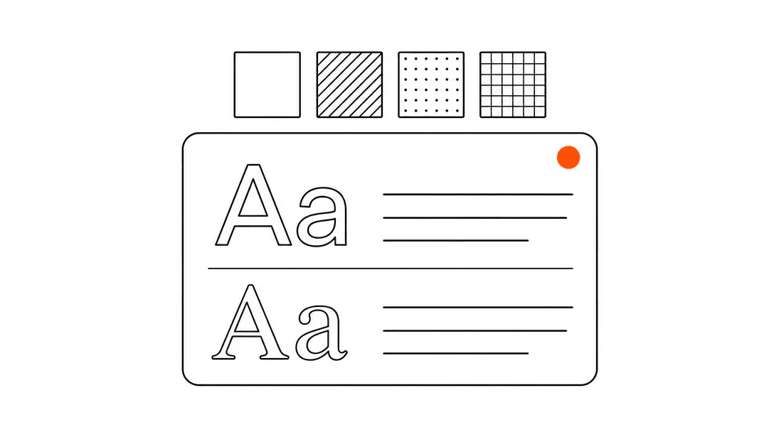
A brand kit is a documented set of design values: colors (as exact hex codes), fonts (names and weights), logo files in the formats you actually use, and a few layout rules like corner radius and spacing. Think of it as the instruction manual for how your business looks, written so that a website developer, an email designer, and a print shop can all produce something that looks like it came from the same company.
The elements that belong in a useful brand kit for a service business are straightforward.
- Primary color: one hex code that represents your brand. Most businesses also have one neutral (a dark gray or off-white) and one accent used sparingly on buttons and highlights.
- Font pair: one typeface for headings, one for body text. Two is enough. Three starts to look cluttered.
- Logo files: at minimum, a full-color version and a white version, saved as both PNG (for documents and emails) and SVG (for websites and scalable use).
- Design rules: how much space to leave around the logo, whether buttons are square or rounded, how large the heading font is relative to body text.
That is the whole kit. It does not have to be a 40-page PDF. For a small service business, a single shared document with those values is enough to keep everything consistent.
Is a brand kit the same as a logo?
A logo is one element of a brand kit. The kit is everything else that makes the logo mean something in context. Your logo is an image file. Your brand kit is the rules for how that image gets used, what colors sit around it, what fonts accompany it, and how all of those elements hold together when someone sees your website, your invoice, and your Google Business Profile on the same day.
A lot of service businesses invest in a logo and stop there. The result is a professional mark sitting on top of a mismatched website, generic email templates, and intake forms that look like they belong to a different company. The logo is fine. The system around it is absent.
Why does inconsistent branding hurt a service business?
Inconsistency erodes trust before a conversation ever starts, and for service businesses where the buying decision is almost entirely trust-based, that erosion is expensive. When a potential client sees three different versions of your business before they book: a polished Instagram, a dated website, and an intake form that looks like a 2009 Google Form, they are already forming a judgment about how organized you are.
Consider what happens across the touchpoints a med spa prospect goes through. She finds the business on Instagram where the feed uses a soft dusty rose palette and a clean script logo. She clicks through to the website, which uses dark navy and a completely different sans-serif font. She books a consultation and gets a confirmation email in a default template with a generic blue button. Three different design languages, all before her first appointment. Each one is a small friction. Together they leave her less confident than she was before she clicked.
This is not a hypothetical. When we audit a new client's web presence, the first thing we check is whether the business looks like the same company across its digital surfaces. In most cases, it does not. The website was built by one person at one time. The emails are a default template. The intake form is whatever the scheduling software defaults to. Nobody sat down and said "make these different." They just accumulated.
How does a brand kit work as a technical configuration?
When we onboard a new client, the first thing we do is extract their brand tokens: primary color, font pair, corner radius, and button style. Those four values get set once as CSS variables and cascade everywhere. Website, emails, proposals, client portal. The business never has to explain their shade of blue to anyone again.
CSS variables (sometimes called design tokens) work like named settings. Instead of writing a specific color code on every button across 30 pages, you write it once at the top of the stylesheet and reference the variable everywhere. Change the variable and every button on every page updates in one move. This is why a properly built website with a brand kit is easier to maintain than one without: the entire visual system has a single source of truth.
The same principle applies beyond the website. Modern email marketing platforms, proposal tools, and client portals all let you set your brand colors and fonts as global settings. Once wired in, every new email or proposal you create inherits the same look without anyone having to think about it.
This is what makes a brand kit a systems asset rather than an art project. It is a configuration file. Set it once, correctly, and the work of looking consistent becomes automatic.
What does a brand kit need to include for a website specifically?
A brand kit for a static marketing website needs a few things a general brand document might not think to include. The full breakdown lives in the fonts and colors guide, but here are the essentials at the website level.
- Exact hex codes, not descriptive names. "Dark blue" is not a useful instruction for a developer.
#1A2B4Fis. - Web-safe font names or Google Fonts links. A font that requires a purchased license and has no web version cannot go on a website without extra setup. Know which fonts you own and how they are licensed.
- Logo as SVG. PNGs pixelate when scaled. An SVG is infinitely scalable and usually smaller in file size, which matters for page speed.
- Favicon and app icon files. These are separate from your main logo: a 32x32 pixel version for browser tabs and a 180x180 version for Apple devices. Most brand kits miss these entirely and they end up as generic browser defaults.
- Social preview image dimensions. When someone shares a link to your site, the image that appears in the preview card is usually a specific dimension (1200x630 pixels for most platforms). If your brand kit does not account for this, the preview pulls whatever image the platform finds first, which may not be the one you want.
A website built on a real complete set of pages with a proper brand kit underneath will hold its consistency even as new pages get added over time. Without one, each new page is a fresh opportunity for drift.
of small businesses using generative AI report efficiency gains, with consistent brand configuration being a prerequisite for AI tools to produce on-brand output.
How do you put together a brand kit for your service business?
Start with what you already have. If you have a logo you like, the color values are already inside it. A designer can pull the exact hex codes from the logo file in minutes. If you had the logo designed professionally, ask the designer for the source file and the color codes. They should already have them documented.
For fonts: if your logo uses a specific typeface, note the name. Then choose a complementary font for body text on your website. The combination does not have to be complicated. A geometric sans-serif for headings and a legible humanist sans for body text covers the vast majority of service business websites without any typographic risk.
Once you have the values documented, the next step is actually applying them. This is where most small businesses stop short. They have a PDF somewhere with the hex codes, but the website still uses whatever colors the template defaulted to, the emails still use the builder's default font, and the intake form is still default white.
Applying the kit means going to each platform your business uses and entering those values in the settings. On a custom website, it means wiring the colors and fonts into the CSS. On an email platform, it means updating the global style settings. On a proposal tool, it means setting up a branded template. This takes a few hours the first time. It saves a lot of friction every time after that.
Does a brand kit matter for AI tools and AI-generated content?
More than most business owners expect. When you use an AI writing tool, an AI image generator, or an AI chatbot that responds to clients on your behalf, the output is only as on-brand as the instructions you give it. A brand kit is part of those instructions. It tells the tool what colors to use, what tone to write in, what the business sounds and looks like.
Without a brand kit, AI-generated content defaults to something generic. With one, you can give the tool the color palette, the font names, the voice guidelines, and the examples it needs to produce output that actually represents your business. As AI tools become a standard part of how service businesses write emails, generate proposals, and respond to reviews, having a documented brand configuration becomes less of a nice-to-have and more of a prerequisite for using those tools well.
When should you update your brand kit?
Three situations reliably call for a brand kit review. First, a full rebrand: new logo, new color direction, new name. The kit gets rebuilt from scratch. Second, a significant expansion: adding a second location, launching a new service line, or creating a client portal that did not exist before. Each new surface needs to be wired into the kit. Third, when you notice drift: you look at your website and your email signature and they feel like they belong to different businesses. That is the signal that the kit exists but was never fully applied, or that it has not been maintained as the business grew.
The update itself is rarely the hard part. Updating the document takes an hour. Going back through every platform and making sure the new values are applied everywhere is the work. This is also why it pays to set things up correctly the first time: a brand kit that is genuinely wired into your systems takes a fraction of the time to update compared to one that lives only as a PDF.