The short answer: a high-converting landing page for a service business puts one clear action above the fold on mobile, loads fast, and removes every reason a visitor might hesitate before taking that action. Everything else is detail.
This post covers that detail. It is part of the broader guide to turning website visitors into customers, focused specifically on the build spec: which sections to include, in what order, how to wire the form and booking path, and what to cut. These are the decisions that separate a page that looks good from one that books jobs.
What makes a service landing page different from other pages?
A service landing page has a single conversion goal: get the visitor to call, book, or submit their info. Most general website pages carry multiple goals (brand awareness, education, navigation). A landing page strips those away. Every section earns its place by moving a visitor closer to that one action, or it gets cut.
That distinction matters because the instinct when building a service page is to load it with information: every service offered, credentials, years of experience, a company history section, a gallery. Some of that context is useful. Most of it creates noise that pulls attention away from the booking step. The visitor who arrived from a Google search for "AC repair near me" already knows they need AC repair. They are not looking for a product catalog. They want to know you can help them, that you are legitimate, and how to get you on the phone.
The job of the page is to deliver those three signals quickly, then make the next step impossible to miss.
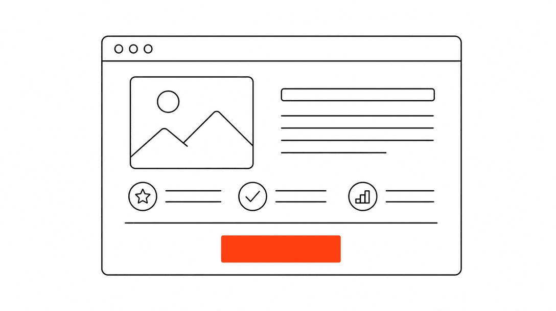
What belongs above the fold on mobile?
Above the fold on a phone should contain: your headline (what you do and who you serve), a phone number or booking button, and one trust signal. That is it.
The headline needs to answer two questions in one sentence: what service are you offering, and where. "Emergency HVAC Repair in Palm Beach Gardens, FL" is specific enough to tell the visitor they are in the right place without making them scroll to find out. Generic headlines like "Your Comfort Is Our Priority" delay that confirmation and cost you visitors who are comparing multiple tabs.
The phone number should be visible as a clickable link on mobile, not tucked in the header's burger menu. On a heat emergency call, a visitor who has to open a menu to find your number will call the next result before they get there. Place the number prominently in the hero block, either as a large tappable button or as styled text directly below the headline.
The single trust signal above the fold can be a review count ("4.9 stars, 200+ reviews"), a years-in-business note, a license badge, or a local credential. One is enough. Stacking four trust badges in a row at the hero creates visual noise and signals insecurity rather than confidence.
of business calls go unanswered, and fewer than 3% of callers routed to voicemail leave a message.
How should the rest of the page be structured?
Below the fold, the page should follow a simple arc: here is what we do, here is proof we do it well, here is what happens next, and here is how to start. Each section answers one question the visitor has at that point in their decision.
Services section. A short list of what you cover, specific to this page's campaign or location. If the page is for HVAC repair in a specific zip code, list the repair types you handle: AC units, heat pumps, ductwork, commercial, etc. Link to dedicated service pages if they exist. Keep it scannable: short bullets or a three-column icon grid, not paragraphs.
Social proof block. Two to four real reviews, ideally with the reviewer's first name and a general location (not made up: pull from your actual Google or Facebook reviews). A review count widget or a badge that pulls your live star rating works well here if you have the integration. If you are building this as static HTML, screenshot the review block from Google and update it quarterly. Real reviews from real customers do more conversion work than any copy you can write about yourself, and understanding what drives conversion rates usually traces back to how much trust a visitor feels before they commit to contacting you.
Process section. A short "here is what happens next" block, typically three steps. Something like: "1. Call or submit a request. 2. We confirm your appointment within 15 minutes. 3. A technician arrives in the window we agreed on." This section removes the biggest source of hesitation for service visitors: not knowing what they are committing to by making contact. When people know the next step is just a phone call, not a contract, they take it more readily.
Secondary CTA. Another booking button or phone number, placed at a natural stopping point around the 60% mark of the page. Long pages need more than one conversion opportunity.
Footer CTA. A final section at the bottom with your headline, phone number, and form. Some visitors scroll all the way to the bottom before they commit; give them a clean landing point.
Form or calendar embed: which booking path actually works?
Both. The visitors who convert best on service landing pages split into two groups: those who are ready to pick a time right now, and those who want to get a quote first without committing to a specific slot. A page with only a calendar embed loses the second group. A page with only a form loses the first.
When we build landing pages for service clients, we always add a dual-submit path: one option is a calendar embed for visitors who want to book directly, and one is a short "get a quote" form for visitors who want to send their details first. The businesses that see the biggest lift from this setup are the ones where a meaningful segment of visitors was not ready to pick a time but would still submit a name and phone number. Those leads come in through the form path, and the business follows up with a call to lock in the appointment.
The form itself should stay short. Three to five fields is the target: name, phone number, service type (a dropdown), and optionally a message or zip code. Collect everything else during the confirmation call or onboarding flow. Every field beyond five meaningfully reduces submission rate. The goal of the form is to get contact information, not to qualify the lead in writing.
For the calendar embed, use whatever booking tool your business already runs. The embed should be mobile-optimized: test it on a real phone, not just a browser resize. Many calendar embeds display acceptably in a desktop frame but require two-finger pinching on an actual phone, which kills the experience. If your booking tool does not embed cleanly on mobile, use the form path as the primary option and link the calendar as a secondary "book directly" text link.
What should happen after a visitor submits the form?
The thank-you step is where most landing pages drop the ball. The visitor submits their form, lands on a generic "thank you, we'll be in touch" confirmation, and the experience ends. They have no idea when to expect a response. That uncertainty is what makes them open three other tabs and submit to your competitors as a backup.
A good confirmation page or modal does three things: sets a specific expectation ("someone will call or text you within 15 minutes during business hours"), gives an alternative in case they need to reach you faster (your direct phone number), and optionally books a follow-up if you use automated lead-response. That last part, an automatic text message to the submitted number within a few minutes of the form submission, changes the experience entirely. The visitor gets confirmation that a real person received their request, and the business makes contact before the visitor has time to reconsider.
On almost every audit we run on service-business funnels, the gap between form submission and first contact is where most leads are lost. The page did its job; the system behind it did not. The landing page is the intake. The follow-up is where the job gets booked.
If you want to understand how the follow-up system connects to the page, the piece on why service businesses lose leads covers the operational side of that handoff in detail.
What kills conversion on service landing pages?
The most common conversion killers, in order of how often we see them:
- No visible phone number on mobile. An HVAC company running a summer campaign had a beautiful page: clean photography, a strong headline, real reviews. The phone number lived only in the desktop header, which collapsed into a hamburger menu on phones. Every visitor with an actual cooling emergency who tried to call had to navigate the menu first. The fix was adding a sticky call button at the bottom of the mobile screen, visible from any scroll position.
- Page speed below acceptable thresholds. Mobile visitors, especially those arriving from paid ads, will not wait for a slow page. Most service-business traffic clicks through on a phone while they are actively dealing with the problem they need help with. A page that takes more than three seconds to show anything useful loses a substantial portion of that traffic before they read a single word. Compress images, defer non-critical scripts, and measure your actual load time on a real mobile connection.
- Too many competing CTAs. When a page has a "book now" button, a "get a free estimate" button, a "call us" button, a chat widget, and a newsletter signup, visitors face a decision about which action to take before they have decided to take any action at all. Pick one primary CTA per page and let everything else support it.
- Generic copy that could be any competitor's page. "We're a family-owned business committed to quality and integrity" appears on thousands of service websites and registers as background noise. Specific copy: license numbers, response time commitments, service area specifics, named neighborhoods, real team members, and real reviews, creates the differentiation that actually shifts a decision.
- Missing social proof. A significant share of local service customers read reviews before choosing a provider. A landing page without reviews is asking visitors to trust you without giving them the social confirmation they expect. Even two or three well-placed reviews with real names and locations close that gap.
How does copy affect whether a page books jobs?
Copy on a service landing page is doing one job: removing doubt. Every sentence either answers a question the visitor has before they book, or it does not belong on the page. That framing makes it easier to decide what to cut.
The headline tells them they are in the right place. The subheadline clarifies what they get and when. The services section tells them their specific problem is covered. The process section tells them what happens if they reach out. The reviews tell them other people trusted you and it worked out. Each element answers one question, then gets out of the way.
The detail that separates pages that convert from pages that look good is specificity. "Fast response times" is vague. "We call or text you back within 15 minutes" is a commitment. "Serving the area" is vague. "Serving Jupiter, Palm Beach Gardens, and Tequesta" is specific enough to confirm relevance for the visitor who searched with a location in mind. Writing copy that actually converts is a fuller treatment of this, but the principle holds at the landing page level: specific claims do more work than general ones.
One note on length: more copy is not always more doubt-removal. A paragraph explaining your company's founding story on a page whose visitor needs AC repair today is not answering any question the visitor actually has. Write toward the decision, not around it.
What is conversion rate optimization, and does it apply to a single landing page?
Conversion rate optimization (CRO) is the practice of systematically testing and improving the elements of a page to get more of its visitors to take action. It applies directly to landing pages, and a single page can be the highest-leverage place to start.
For most service businesses, a landing page does not need a sophisticated A/B testing program to improve. The gains available from fixing the obvious problems, a missing phone number on mobile, a slow load time, a form with seven fields, a vague headline, are larger than what testing minor variations will yield. Fix those first. Once the page is structurally sound and traffic is consistent, then testing variations (headline A vs headline B, calendar vs form as the primary CTA) becomes meaningful.
The metrics worth tracking for a service landing page: form submission rate, phone call click rate (on mobile), and confirmation page reach rate. Those three numbers tell you where in the funnel visitors are dropping. If submission rate is fine but jobs are not getting booked, the problem is in the follow-up system, not the page itself. What CRO actually means for a small business goes deeper on where to start and what to measure.
What technical details matter most for a service landing page?
Speed, mobile rendering, and form reliability. Those are the three that directly affect whether visitors book.
Speed. Compress all images before publishing. A hero image that is 3MB will make the page feel slow on any mobile connection. Aim for under 200KB for the hero image at mobile display size. Defer or remove any third-party scripts that are not critical to the booking flow. Every script tag that loads at page open is adding time before the visitor can interact with the page.
Mobile rendering. Test the page on a real phone, not just a browser dev tools resize. Open it on iOS Safari and Android Chrome. Check that the form fields are large enough to tap without zooming, that the calendar embed scrolls correctly if you are using one, and that the sticky phone button (if you have one) does not overlap content in a way that makes the page hard to read.
Form reliability. Test every submission path before publishing. Submit the form yourself and confirm the notification reaches your CRM or email. Check that the confirmation message displays correctly on mobile. If you are using an integration to a CRM or booking system, test that the lead data populates correctly. A form that looks like it submitted but silently failed is one of the most common and most invisible conversion problems in service-business websites.
Local schema markup also matters here, though it operates at the technical layer rather than the visual one. Proper schema on a service-area page helps search engines understand which locations you serve and what services you offer, which in turn affects when and how you appear for local intent searches. The specifics of that are covered in the conversion systems guide and the visibility cluster, but the short version: a landing page that is built correctly at the technical level earns more of the traffic that the conversion work is designed to capture.